Whenever I see an example of a graphic design or signage ‘fail’, I snap a photo of it. These examples have all been captured in and around Lymington over the years and I thought that they were a good way to demonstrate the importance of proofreading, whilst highlighting some common graphic design and packaging mistakes.
I’m aware that it’s all too easy to laugh at the mistakes of others – I’ve certainly been guilty of the odd typo… but I collect examples like these partly to remind me what can go wrong – and to always do my utmost to avoid the same mistakes.
When seen in isolation, errors are often overlooked – such as the three ‘S’ characters in the word accessories, sign-written on to a car parts shop window.
Errors like these are surprisingly easy to make, which is why we double and triple check everything that leaves the Tinstar studio – but occasional slip-ups can still squeeze through the net.
Proofreading is probably one of the toughest disciplines to master in graphic design because not only demands an exacting eye for detail but a mastery of grammar and spelling; not to mention a basic knowledge of where apostrophes should be used…
Proofreading & Apostrophes
This window graphic was spotted in a small village outside Lymington. A car parts and accessories shop had engaged a signwriter to apply vinyl lettering to their window in order to promote their wares and services.
Perhaps the sign-writer had a surplus of ‘S’ characters in his bag or was being paid by the letter – or perhaps he wanted to emphasise the very wide range of accessories available. In any event, that’s a whole lot of accesssories.
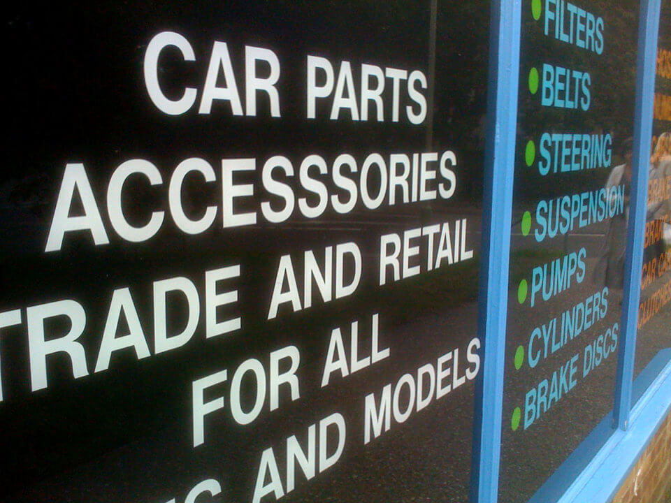
Car parts and accesssories – that’s a lot of S
 Much more common is the misplaced apostrophe. Whenever there’s uncertainty about whether or not this humble punctuation mark should be used, it’s plopped into plurals and possessive words alike.
It’s a simple enough mistake to make, but one which elicits a reaction akin to that of Marmite. Some people are driven to distraction by erroneous punctuation marks – and others are perfectly understandably unconcerned.
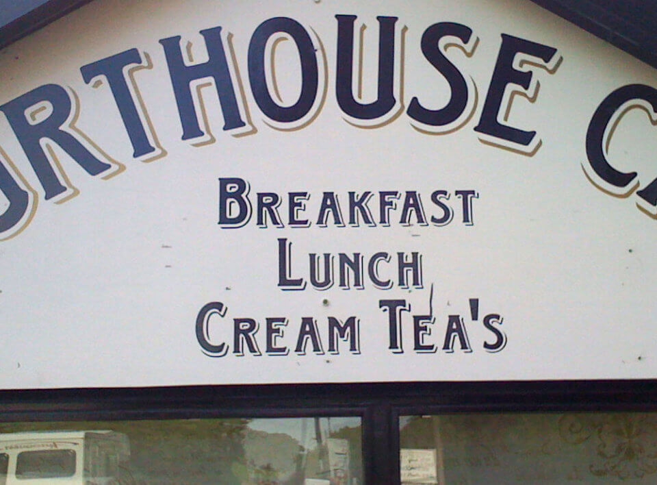
Living and working in the New Forest, I find that cream teas are a common target.
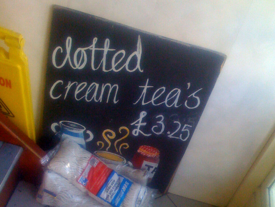
£3.25 belongs to clotted cream teas.
Mixed Messages

The Post Office selling votes for women
Also reasonably common is the placement of two messages adjacent to each other leading to (at best) confusing instructions or (at worst) the wrong message altogether.
Our local post office seemed to be selling votes for women; probably not the right message to convey when promoting the sale of a series of Women’s Suffrage stamps.
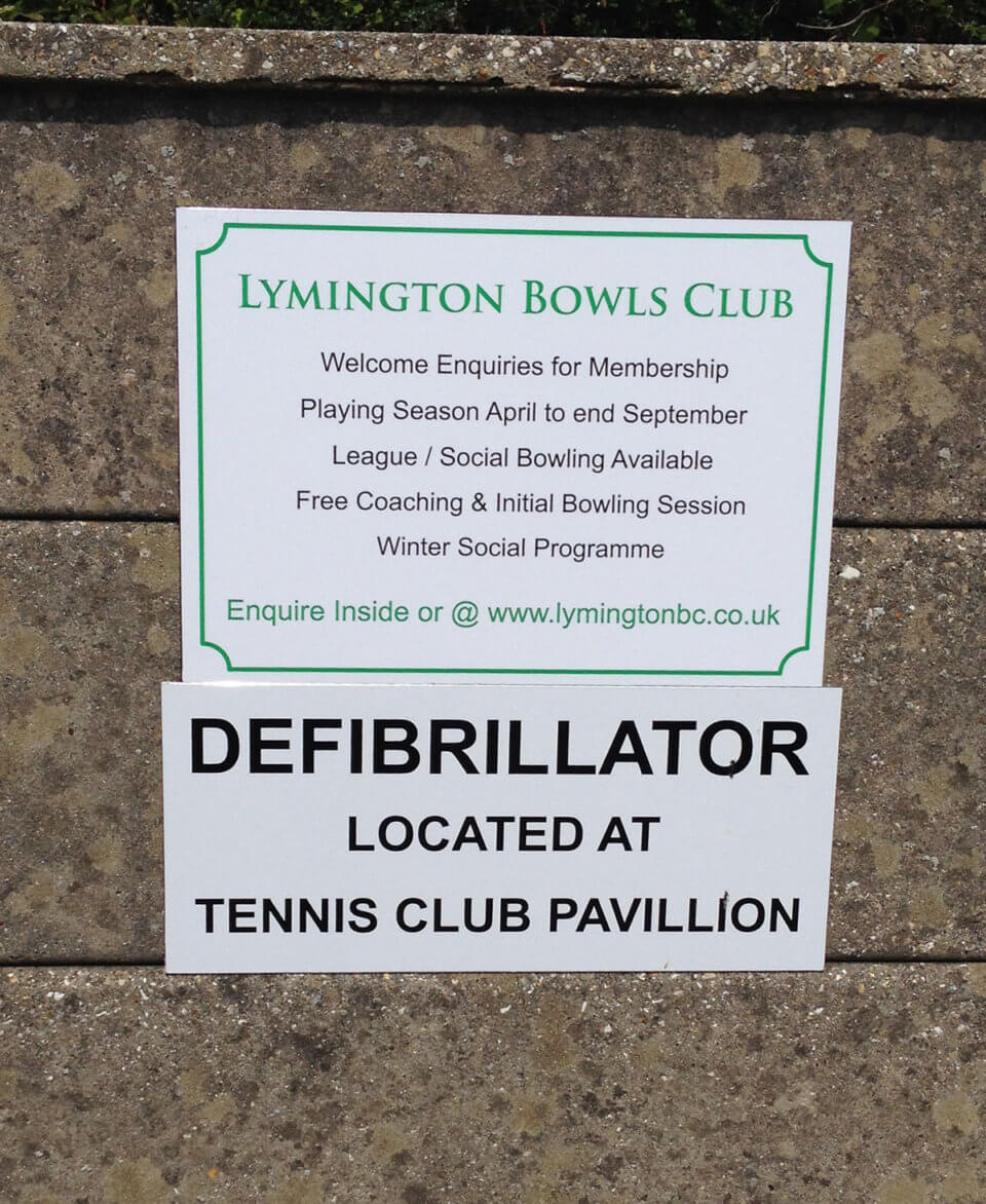
Meanwhile, a local bowling club makes it very clear to the public what might be expected to happen to its members. Useful, if distressing, information.
Mixing messages
The Wrong Message to the Wrong Audience
I’m willing to bet that on the other side of the little sign below is a sentence designed to entice the customer of this national bakery to buy another Yum Yum. Needless to say it’s extremely important to know your target audience – and the simple act of putting this sign the wrong way around has resulted in the customer feeling a little manipulated.
As it happens, I would.
Over-Promising and Under-Delivering
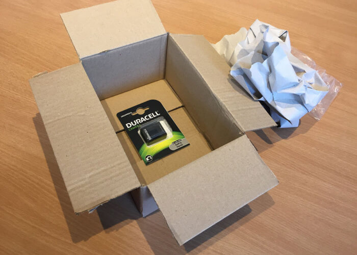
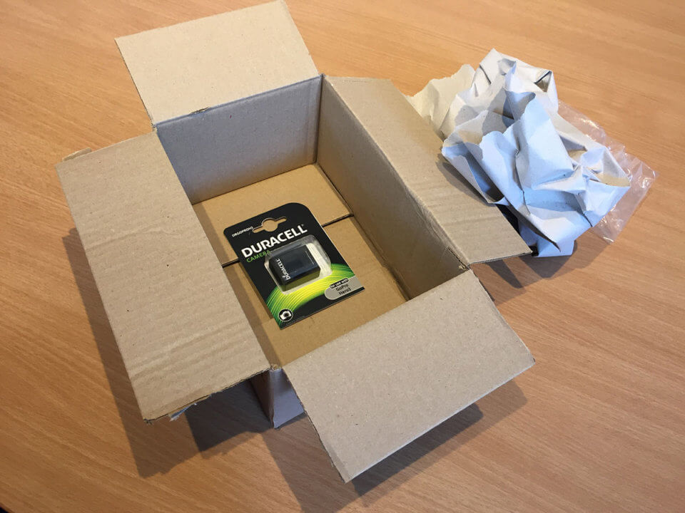
Amazon is often guilty of ‘shipping air’. How many times have you had a massive cardboard box delivered that contains nothing but a small battery or USB stick? Speaking for myself, plenty. To their credit, they are taking steps to end wasteful packaging like this – but not before they delivered this roomy box.
Tesco made a promise that they failed to keep, plain and simple. And at Christmas, too. For shame.
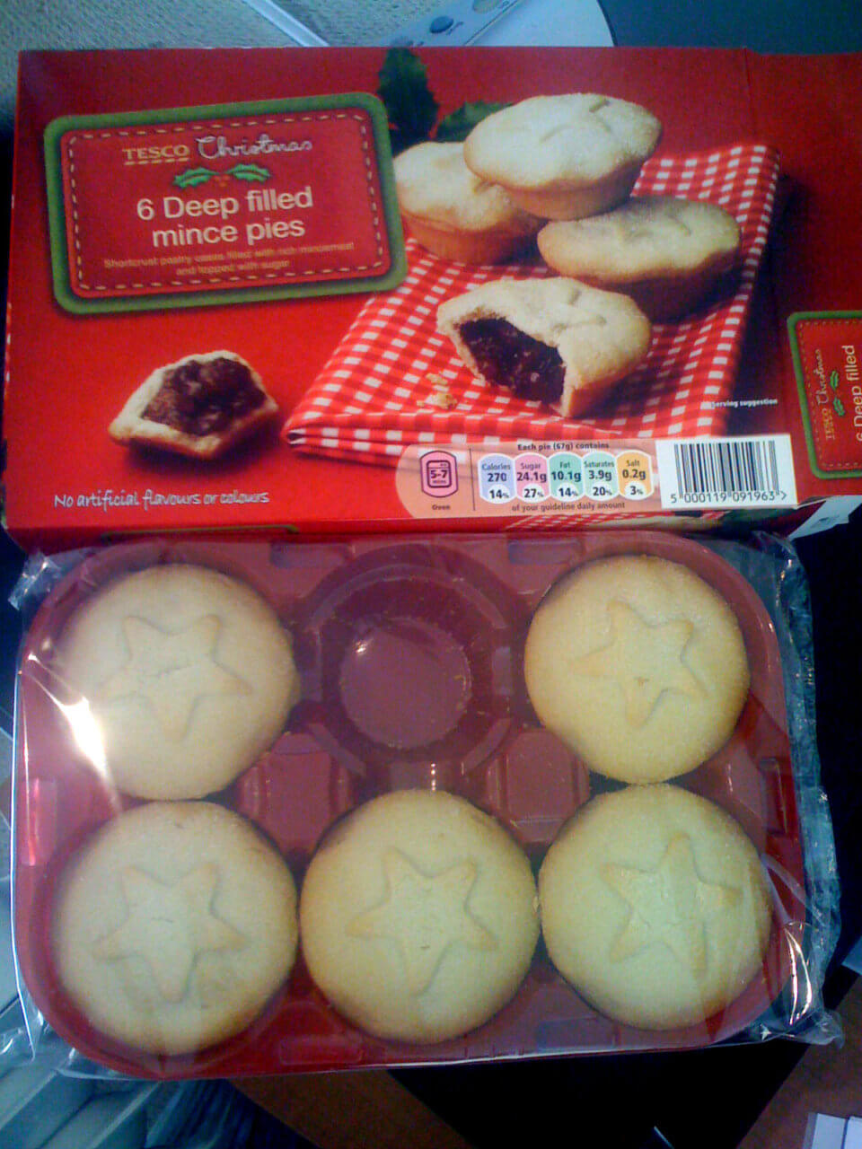
Who ate all the pie?
Delivering the Bare Minimum Results
I’m always telling my kids that if they want to enjoy doing a job more, then do it well. This is the simple truth of how to achieve job satisfaction. The chap that restored the lettering on this SLOW road sign obviously didn’t get the memo.
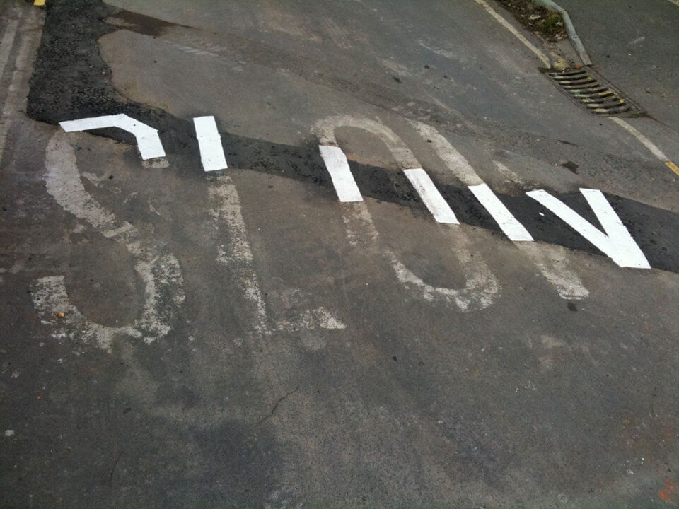
The bare minimum
…and back to work.