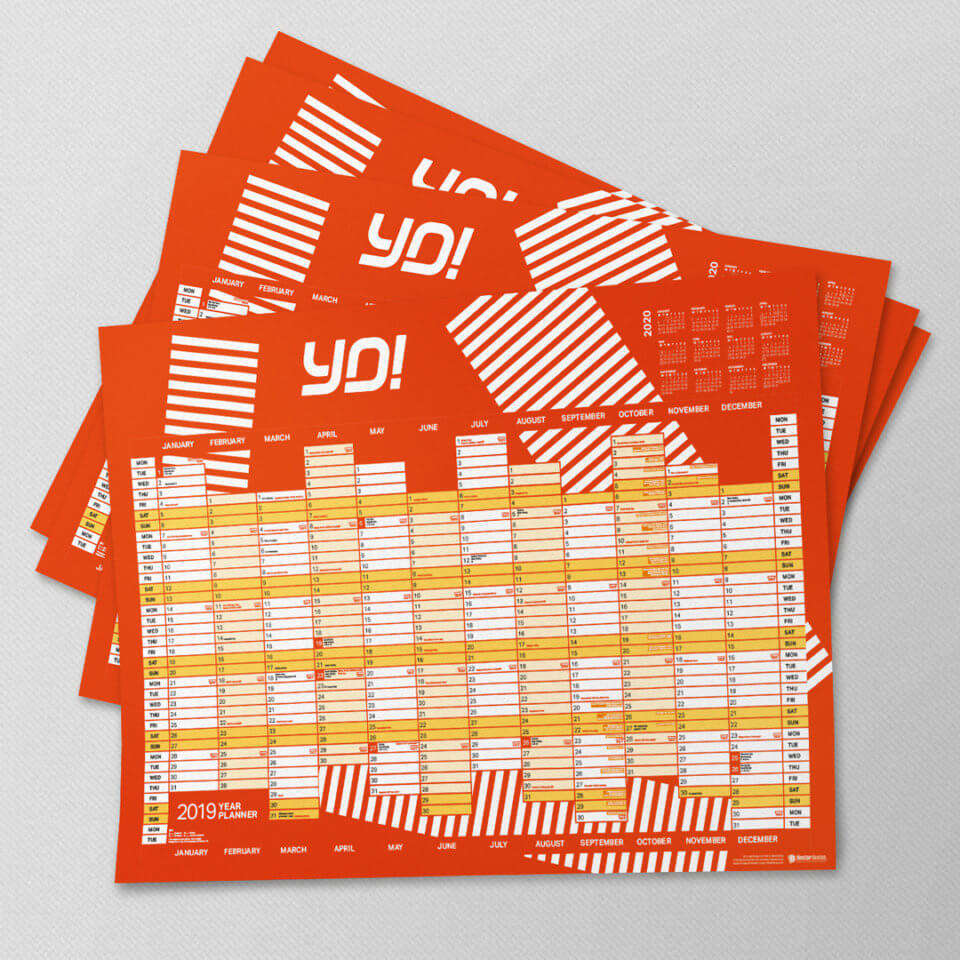
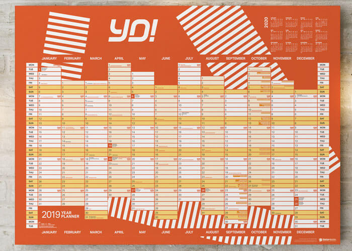
Amongst all of the brand guidelines within which we have worked, those of YO! Sushi have offered the most creative possibilities.
Some of the ingenious graphic elements available within the guidelines include seemingly random lines that are actually representative of Tokyo telephone cables.
When we were asked by YO! Sushi Corporate to design a year planner for UK franchises, we selected a pattern of blocks that were inspired by the road markings of the famous Shibuya Crossing in Tokyo, the busiest of its kind in the world.
When combined with the striking logo and colour scheme, the result was a wall calendar that fit right in with the other business marketing assets… which, of course, is the intention of brand guidelines.


